
This resource is adapted from our Digital Tips e-mail series. To sign up to receive these resources in your inbox regularly, join our network.
Tutorial: Line Height
Look at the paragraphs below. Which one is easiest for you to read?
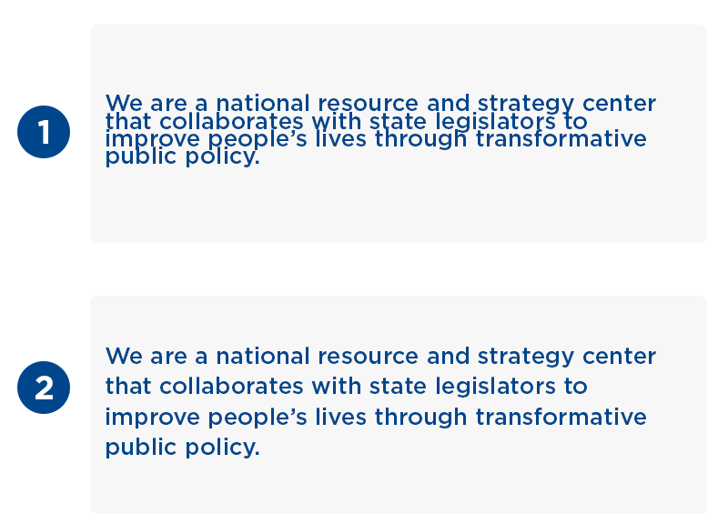
If you chose option 2, you, like most people, find proper spacing essential to readability.
One of the most important elements to consider when adding text to graphics is line spacing, also known as leading.
Here's a handy rule: Line spacing should be 125% to 150% of your font size. Different programs measure line spacing differently; since many legislators use Canva for graphic design, I'll use it in this example.
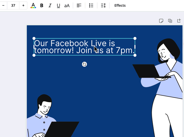
In Canva, the line spacing value (called "line height") is relative to the font size. So you should set your line spacing to a value between 1.2 and 1.5.
Bonus Tip: Don't squash too many details in one graphic! Remove unessential information and include extra details in the post or tweet's caption.
Quick Links: Digital Resources From Around The Web
🗣 Tips for Getting Used To The Sound of Your Own Voice
🏳️⚧️ The Gender Spectrum Collection: Stock Photos Beyond the Binary
📸 Twinsta: Share Your Tweets on Instagram
🔠 The Ultimate List of Social Media Acronyms and Abbreviations